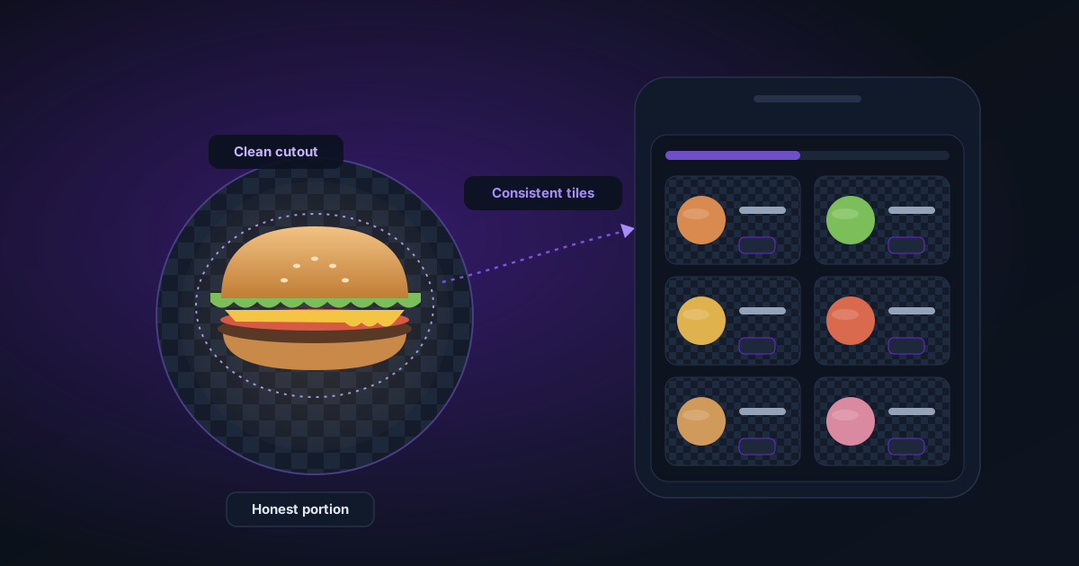
Appetising Food Cutouts for Delivery Apps and Digital Menus
Delivery apps show your dishes as tiny tiles in a crowded grid. Here's how to shoot food for clean cutouts and keep every menu tile consistent without overselling the portion.
By Novus Stream Solutions Editorial Team · Part of the Publishing and marketplace requirements topic cluster
Open any delivery app and your carefully plated dish gets about a thumbnail's worth of screen: a small tile in a scrolling grid, wedged between nine other kitchens all chasing the same tap. At that size the moody shot you took on a reclaimed-wood table (linen napkin bunched to one side, a sprig of thyme just in frame), reads as brown food on brown noise. The napkin becomes a grey smudge. Nobody can tell what they're looking at, so they keep scrolling.
The fix is rarely a better camera. It's cleaner, more consistent presentation. And for a menu built from dozens of tiles, consistency is the part most kitchens get wrong.
Why the tile format punishes a busy table
A delivery tile is small, roughly square, and surrounded by competitors. Whatever detail survives that shrink has to do the selling. Props that look charming at full size (cutlery, a folded cloth, a second glass out of focus) collapse into visual clutter once the image is a couple of hundred pixels wide.
Delivery-app tile sizes and crops change often and vary between platforms, so don't build your workflow around a specific pixel figure. The principle holds regardless: the smaller the tile, the more a clean, high-contrast subject wins. A dish that fills the frame against a calm background is legible at any size. A dish lost in a scene is not.
This is a different problem from general e-commerce product shots. If you want the broad tooling landscape (which removers handle fine edges, how the main services compare), read best background removal tools for product photography. Food adds constraints that guide doesn't cover: appetite appeal, awkward subjects, and honesty at thumbnail scale rather than spec-sheet accuracy.
Food is a genuinely awkward cut-out subject
Be warned before you start: some dishes cut cleanly and some fight you the whole way. An honest list of what tends to go wrong:
- Steam. Background removal treats your subject as opaque. Steam is semi-transparent and low-contrast, so it usually either vanishes entirely or leaves a milky halo along the top edge. If steam is the whole point of the shot, don't cut it out. Photograph it on the background you actually want.
- Glossy sauces and glazes. A cutout changes the outline, not the surface. If your kitchen ceiling is reflected in a lacquered glaze, that reflection stays baked in. You have to control it at capture, not afterwards.
- Drinks and glassware. Transparent glass with liquid confuses every remover. It either keeps the old background showing through the glass or hard-cuts the rim. Shoot drinks straight onto the target background if the glass matters.
- Fine garnish. Microgreens, dill fronds, and a light dusting of icing sugar behave like flyaway hair: thin, wispy, easy to lose. Some survive, some get shaved off.
- Dark food on a dark plate. A dark-crust pie on slate gives the edge detection almost nothing to work with. Lift the contrast underneath and the cut gets far more reliable.
None of this means give up. It means choose your battles: the dishes that cut well go to transparent tiles, and the ones that don't get shot on a fixed background from the start.
Shooting for a clean cut
You control most of the outcome before you ever touch software. A short field guide:
- Pick one angle for the whole menu. Either a flat overhead or a consistent three-quarter hero angle, then use it for every dish. Mixing overheads and hero shots makes the finished grid feel jumbled even when each photo is good.
- Contrast under the plate. Shoot on a surface that differs in tone from the crockery so the outline is unambiguous. A white plate on a white table is the worst case you can hand a cutter.
- Soft light from one side. A diffused window or a softbox beats a bare bulb or on-camera flash, which throw a hard hotspot across anything glossy and blow out the edge you need.
- Fill the frame, but leave a margin. Crop tight to the plate and you give the cutter nothing to grab and leave yourself no room for a square recrop. A little breathing space around the food is worth the pixels.
- Neutral crockery. Busy patterned plates compete with the food at tile size. Plain white or a single house colour reads cleaner.
- Shoot more frames than feels necessary. Steam, drips, and garnish shift between exposures, and you want the frame where they landed well.
Building a consistent menu
A coherent menu isn't twenty nice photos. It's twenty photos that look like they belong together. Decide these once and lock them for the whole shoot:
- Background: one colour behind every tile, or transparent cutouts placed on a single brand colour.
- Angle: all overhead, or all hero. No mixing.
- Framing and scale: each dish occupies a similar share of the frame so the grid looks even.
- Lighting direction: same side, same session.
- Plate style: the same plate, or a small deliberate set.
Then the production workflow:
- Batch-shoot in one sitting with a fixed setup: same spot, same light, same camera height. Nothing wrecks consistency faster than returning a week later and rebuilding the scene from memory.
- Remove the background on each shot to a transparent PNG using the background remover. It runs entirely in your browser. The photos never leave your device, there's no account, and it's free, which matters when you're pushing thirty dishes through in an afternoon.
- Place every cutout on one canvas of the same size and brand colour in the image editor, at the same position and scale. This is where a set of separate shots becomes a matching grid.
- Upscale the soft ones. Older phone shots or tightly cropped frames can go a little soft; run them through the image upscaler so the whole menu holds together instead of one blurry tile giving the game away.
- Export at one size and hand the platform a uniform set.
The payoff is subtle but real: a menu where every tile shares a background, an angle, and a light direction looks professionally art-directed even when it was shot on a phone against a bit of card. A menu of mismatched scenes looks like a scrapbook, and scrapbooks don't convert.
Keep it honest
The tempting mistakes are the ones that get you in trouble.
A cutout lets you clean a background. It does not let you invent a portion. Don't photograph one prawn and clone it into a dozen. Don't quietly crop out the fact that the curry arrives in a plastic tub. Delivery platforms and consumer-protection rules expect the listing image to match what turns up at the door, and a customer who feels misled leaves a one-star review that costs you far more than a tidy tile ever earned. Represent the real thing at the real size.
The other honest limit: a cutout can't rescue food that was badly styled or badly lit. If the dish looks tired in the raw frame (greying salad, split sauce, a bun gone flat), it will look exactly as tired on a spotless background. Clean presentation amplifies whatever you photographed; it doesn't repair it. When the raw shot is poor, the right move is to reshoot, not to reach for another slider.
Get the capture right, cut the dishes that cut well, shoot the awkward ones on their final background, and keep the whole grid to one set of rules. Do that and your menu stops looking like twenty separate kitchens and starts looking like one you'd want to order from.
Applies to NSS Background Remover v2.0.0 — the release that was current when this article was published.
Was this article helpful?
Your answer is saved in this browser only. This control makes no network request and does not send the answer to an NSS feedback endpoint.