Album and Podcast Cover Art: Sizes, Safe Zones and Clean Graphics
Your cover art lives most of its life as a tiny square, sometimes circle-cropped with a play button on top: here's how to size, place and cut out art that still reads at thumbnail scale.
By Novus Stream Solutions Editorial Team · Part of the Publishing and marketplace requirements topic cluster
Your cover art will spend most of its life smaller than a postage stamp. In a playlist row it sits at roughly the size of a fingernail; on a lock screen it's a little bigger; on a smartwatch, a car display or a voice-assistant screen it can be smaller still, sometimes with a translucent play triangle parked over one corner. The 3000-pixel master you carefully exported is almost never what a listener actually sees.
That gap, between the file you upload and the tiny square people scroll past, is the whole problem. Design for the master and your art turns to mud at thumbnail size. Design for the thumbnail and it holds up everywhere.
The square is the only thing you control
Every major audio platform (Spotify, Apple Music, Apple Podcasts, Bandcamp, YouTube Music) wants a 1:1 square. That is the one constant. Everything downstream of it (the crop, the overlay, the display size) is out of your hands, so the square has to do all the work.
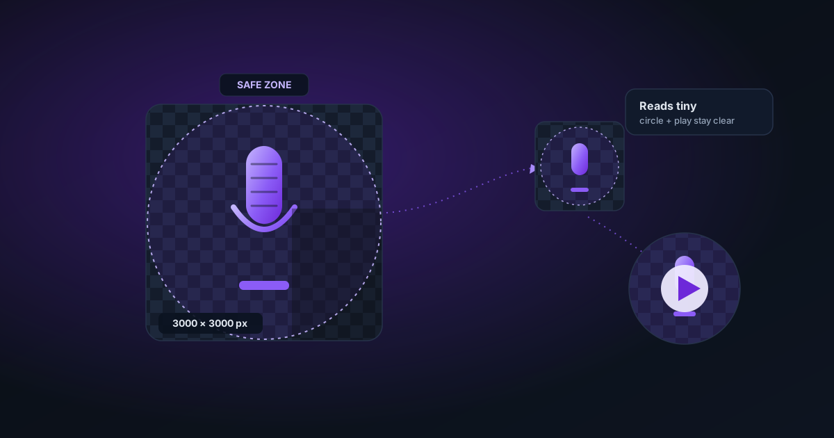
For the master file, export big. A 3000 × 3000 pixel square is a safe, widely accepted target; many distributors accept anything from around 1400 pixels a side up to 3000, in RGB colour (never CMYK, which is for print), saved as JPEG or PNG. Those exact minimums and maximums drift, and each distributor has its own rules, so confirm the current numbers with whoever you upload through rather than trusting a figure you read once.
One more thing distributors care about: content. Many routinely reject artwork that contains a web address, a social handle, a price, or anything that looks blurry or pixelated. Check your distributor's artwork guidelines before you finalise. A rejection can cost you a release date.
Where your art actually gets shown
Before you place a single element, picture the surfaces it has to survive:
- Playlist and library rows: a small square next to a track title, often the smallest it ever appears.
- Now Playing and lock screens: larger, but frequently with playback controls overlaid along the bottom.
- Search results and thumbnails: small, dense, competing with dozens of neighbours.
- Circular crops: artist avatars, some app widgets, and certain watch and car interfaces clip your square into a circle, quietly deleting the corners.
- Play-button overlays: web players and hover states drop a play control over the art, usually centre or bottom-corner.
You cannot predict which surface a given listener uses. So design for the meanest one: tiny, circle-cropped, with a button on top.
Safe-zone thinking
Borrow the idea from broadcast. Imagine a circle inscribed inside your square, touching the middle of each edge. Keep anything that must not be lost, your subject's face and any text, inside that circle. The four corners are expendable; treat them as bleed.
Then leave a margin. Elements shoved against the edge look cramped at full size and get shaved off at small ones. And keep text clear of the bottom-centre, where play buttons and progress bars tend to land.
Make it read at thumbnail size
This is where most home-made covers fall down. They're designed at 3000 pixels on a big monitor and never checked small.
- One subject, big and simple. A single face, object or bold shape survives shrinking. A busy collage becomes noise.
- High contrast. Strong separation between subject and background is what keeps the image legible at 48 pixels.
- A tight palette. Two or three colours read as a recognisable identity in a scroll; a rainbow reads as sludge.
- Minimal text, set large. Your name and title already appear as metadata beside the art, so you often need less type than you think, or none. If you do add text, make it big and heavy. Thin, delicate fonts vanish first.
- Avoid fine detail and banding. Hairline textures disappear; smooth gradients can band into ugly stripes on cheaper screens.
Then run the only test that matters: shrink your design to roughly 64 pixels, or just step back from the monitor and squint. If you can't tell what it is, neither can a listener thumbing through a playlist.
A clean-subject workflow
A lot of strong covers are one isolated subject on a flat or simple background. Here's how to build that without uploading your work to anyone's server. Every step below runs in your browser.
- Cut the subject out. Drop your portrait or product shot into the background remover to lift the subject onto transparency. A clean edge here is what lets you place it confidently inside the safe circle.
- Compose it. Take the cutout into the image editor: set a background colour or texture, position the subject within the safe zone, add your title if you want it, and check the balance with the corners mentally clipped.
- Master it. If your source was small (a phone snap, an old logo) finish in the image upscaler to reach a clean 3000-pixel square.
Be honest about that last step. Upscaling enlarges what's there; it does not invent detail that was never captured. A crisp 1500-pixel source scales up nicely. A soft, compressed 400-pixel screenshot will still look soft, just bigger. If that's all you have, re-shoot or re-export from the original vector or master rather than hoping the upscaler rescues it.
Podcast art plays by the same rules
Podcast show art is the same square, shown in the same small rows and circular crops inside Apple Podcasts, Spotify and every other player. The sizing logic is identical: a large RGB square, commonly somewhere in that 1400-to-3000-pixel range, confirmed against the platform's current spec.
The one difference is text weight. A podcast lives or dies on its name being readable, because there's no track list doing that job for you. Set the show title large, keep it inside the safe circle, and test it at row size. If the name isn't legible small, the art isn't finished.
A note on motion
Spotify's Canvas, that short looping visual behind a track, is a different discipline: a vertical 9:16 clip, a few seconds long, silent and looping. It's not your cover art rotated; it's its own composition with its own safe zone, since controls sit over the lower third. Length and format specifics change, so check the current requirement before you export. It's still just pixels, though, and the same in-browser tools apply if you want to build or tidy one up.
Quick checklist
- Square 1:1 master, exported large (3000 × 3000 is safe), RGB, JPEG or PNG.
- Confirm the exact size, format and content rules with your distributor.
- Keep face and text inside a centred circle; treat corners as expendable.
- Clear the bottom-centre for play controls.
- One subject, high contrast, tight palette, minimal large text.
- Test at around 64 pixels before you upload.
Cover art and YouTube thumbnails get lumped together as "the picture on the thing," but they pull in opposite directions. A thumbnail is a wide 16:9 panel built to be clicked, where more text and a busier composition can work; cover art is a small square built to be recognised, often circle-cropped and never clicked at all. If you make both, read our YouTube thumbnail design guide for the wide-format side, then design each for the shape it actually lives in.
Applies to NSS Background Remover v1.9.0 — the release that was current when this article was published.
Was this article helpful?
Your answer is saved in this browser only. This control makes no network request and does not send the answer to an NSS feedback endpoint.