Image Prep for Self-Publishing: Covers and Interiors That Pass Review
Transparent diagrams that print as black boxes, covers flagged low-resolution, colours that shift on paper: how to prep book covers, headshots and interiors that pass self-publishing review.
By Novus Stream Solutions Editorial Team · Part of the Publishing and marketplace requirements topic cluster
A transparent-background diagram that looked clean in your manuscript renders as a solid black rectangle in the Kindle preview. A cover photo that filled your laptop screen gets flagged "low resolution" the second you switch to the print previewer. Neither problem shows up early. Both wait until you are most of the way to hitting publish, which is exactly why they catch first-time authors out.
The root cause is that self-publishing asks one set of source files to do two very different jobs. An ebook is light on a backlit screen; a paperback is ink on trimmed paper. The same image behaves differently in each, and the platform's review tools check for both. Here is what each asset needs, by type.
Ebook and print are not the same picture
Before the asset-by-asset detail, hold one distinction in your head:
- Ebook images live on screens. They are RGB, judged in pixels, and viewed on everything from a bright phone to a grey e-ink slab. Backlit and variable.
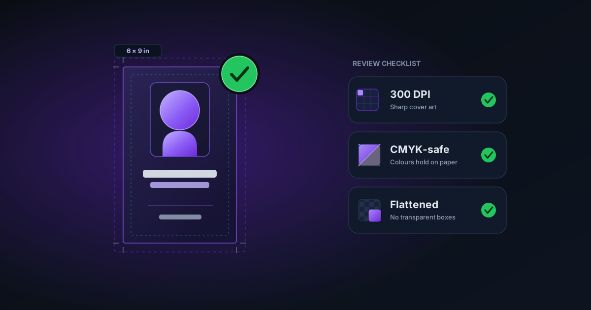
- Print images are ink on paper. They need enough resolution to survive printing (300 DPI is the long-standing print target), they need bleed if they touch the page edge, and their colour is CMYK whether you prepare for that or not.
Prepare each asset for the format it actually lands in. A file that is perfect for one is often wrong for the other.
The cover
Ebook cover
An ebook cover is a tall portrait rectangle in RGB. Platforms publish a minimum long-edge pixel count and a preferred aspect ratio (roughly one and a half to one point six times as tall as it is wide is common). Confirm the current numbers on the platform's own cover spec sheet rather than trusting a figure you read in a forum two years ago.
Start from the largest, sharpest source you have. You can always scale a big cover down; you cannot invent detail that was never captured. If your only artwork is small and soft, run it through the image upscaler before you add the title text, upscaling a cover after the type is baked in softens the lettering along with everything else. Be honest about the ceiling, though: a 400-pixel scribble blown up to full cover size is still a 400-pixel scribble with more pixels. Upscaling buys headroom, not miracles.
Print cover
A print cover is one flat wraparound file (back cover, spine and front, in a single image), and it is where guessing does the most damage.
- Let the platform build the template. Spine width depends on your page count and paper stock, so you cannot finalise it until the interior is locked. The platform generates a template with the exact trim, spine and bleed dimensions for your book. Use it. Do not eyeball the spine.
- Run art into the bleed. Anything that reaches the page edge (a background colour, a full-bleed photo) must extend past the trim line so the cutting blade cannot leave a thin white sliver. Keep titles, faces and anything you care about well inside the safe margin.
- Resolution is not optional. A cover that looks crisp on screen at 72 DPI can hold a fraction of the pixels print needs. When the previewer flags low resolution, believe it and go back to a bigger source.
- Colour will shift, so order a proof. Screens emit light; paper reflects ink. Most KDP-style platforms accept an RGB cover and convert it to CMYK for you, and in that conversion the punchiest colours (electric blue, hot orange, pure red) tend to dull or drift. The only reliable way to judge the final colour is a physical proof copy in your hands. Do not approve print colour from your monitor.
The author photo
Your headshot is almost always a screen asset (the author page, the "about the author" block, a retailer profile), so RGB at a sensible screen size is fine.
The one thing worth doing is cleaning up the background. At thumbnail size a busy kitchen or a distracting doorway reads as clutter; a plain, even backdrop looks deliberate. Removing the original background and dropping in a flat tone takes a couple of minutes, and it reads as more professional exactly where people first size you up. Flatten the result onto a solid background before you place it. A headshot saved with transparency can trigger the same black-box surprise as any other image (more on that next).
If the same photo also goes into a print interior, an about-the-author page in the paperback, it now has to clear the print resolution bar as well. Check the pixel count and upscale it if it is thin.
Interior images
Interiors are where the black rectangle comes from.
Flatten everything. A PNG that carries transparency can render as a black or unpredictable block in some e-readers and print pipelines, because the reader does not composite the alpha channel the way your editor does on screen. The fix is boring and reliable: flatten every interior image onto a solid background, usually white, before you place it in the manuscript. The image editor does this in one step. If you want to understand why transparent files turn black in the first place, why your transparent PNG shows black in Photoshop walks through the alpha-channel mechanics.
This is the opposite of merch. On a print-on-demand sticker or T-shirt you fight to preserve transparency so the artwork sits cleanly on the product, see transparent PNG for print on demand, but inside a book you almost always want the transparency gone.
Check your diagrams in greyscale. Print interiors are frequently mono, because colour interior printing costs considerably more. A chart where a red line and a green line carry different meanings collapses into two identical grey lines when it is printed in black and white. Convert to greyscale and look before you commit; e-ink screens are low-contrast too, so a pale-grey diagram can wash out entirely. If the meaning survives, good. If it does not, redraw with labels, dashes or fill patterns instead of relying on colour.
Size for how the book flows. A reflowable ebook lets the reader change the font size, and your images ride along at whatever width the device gives them, so a diagram full of tiny text can become unreadable on a phone. A fixed-layout book holds your design but is heavier and less flexible. Know which one you are making, and size and label interior images so they still work at the smallest screen they might land on.
Give line art the resolution it wants. Photographs are forgiving; crisp line drawings, diagrams and hand-lettering are not. Fine lines need noticeably higher resolution than a photograph to stay sharp, and a pen sketch scanned at photo resolution comes out furry. Scan or export line art high.
Keep ebook files lean. Some royalty models charge a per-download delivery fee based on file size, so a bloated 20 MB full-page image quietly taxes every sale. Compress interior images sensibly rather than dropping in camera-original files.
A pre-upload checklist
- Start every asset from the largest, sharpest source; upscale small art before adding text.
- Cover in RGB; use the platform's generated template for spine and bleed; order a physical proof to judge colour.
- Trust the low-resolution warning: do not talk yourself past it.
- Flatten every interior image (and your headshot) onto a solid background.
- View colour diagrams in greyscale and confirm they still make sense.
- Keep ebook image files compressed and lean.
None of this is glamorous, and that is the point. The images that pass review on the first try are the ones prepared for the medium they land in, screen or paper, rather than the ones that merely looked right in the window where you made them. Confirm the exact pixel, trim and bleed numbers against the platform's current spec sheet, prepare each asset for its real destination, and the previewer stops arguing with you.
Applies to NSS Background Remover v1.9.0 — the release that was current when this article was published.
Was this article helpful?
Your answer is saved in this browser only. This control makes no network request and does not send the answer to an NSS feedback endpoint.