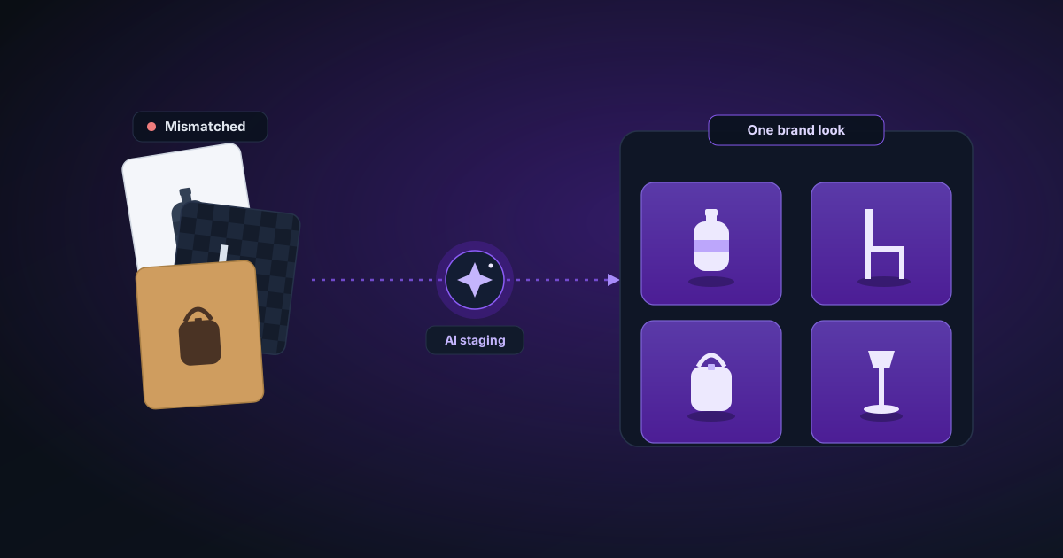
Building a Catalogue That Looks Like One Brand: AI Staging for Consistent Product Shots
A mismatched grid of product photos reads as amateur instantly. How to use background removal plus AI scene compositing to give an entire catalogue one consistent, on-brand look — without re-shooting a single item.
By Novus Stream Solutions Editorial Team · Part of the Publishing and marketplace requirements topic cluster
Pull up the storefront of a brand you trust and notice what your eye registers before you read a word: the photos match. Same framing, same light, same backdrop, same mood across every product. Now pull up a struggling shop — and you'll see a patchwork. One photo shot near a window, the next under a yellow kitchen bulb, a third on a different table. Nothing is technically wrong with any single image, but together they whisper "not a real business."
Consistency is a brand signal, and it's one of the few you can fix entirely in post-production — no re-shoot, no studio. This is a workflow for taking a ragtag set of product photos and turning them into a catalogue that looks like it came from one camera on one day.
Why consistency beats quality (up to a point)
A counterintuitive truth: a catalogue of consistent, good photos outperforms a catalogue of inconsistent, great photos. The customer isn't grading individual images; they're forming a gut impression of the whole shop. Five gorgeous shots with five different backgrounds still read as chaotic. Twenty merely-solid shots with one shared treatment read as a brand. Aim for consistency first; polish individual hero images second.
The core move: separate the product from its scene
Every product photo is two things glued together — the product and the scene it was shot in. The whole problem is that you can't control the scene after the fact when they're glued.
So unglue them. Run each photo through the background remover to lift the product out as a transparent PNG. Now you hold a library of products with no scene — clean cutouts you can drop into any backdrop you choose. The inconsistent original backgrounds are gone; you're back in control of the scene for every item at once.
Two ways to restage, depending on the look you want
Option A — the clean, catalogue look (solid or gradient)
For a crisp e-commerce grid, drop every cutout onto the same background colour. Pick one — a soft warm grey, a brand pastel, pure white — and apply it to all of them. Because the cutouts are transparent, the backdrop is literally identical pixel-for-pixel across the catalogue. That's the most consistent a grid can possibly be.
Use Add Background to fill each cutout with your chosen solid or gradient. Save the colour value (hex code) somewhere so you reuse the exact same one every time you add a product later.
Option B — the lifestyle look (real scenes)
For a brand that sells a feeling — homeware, beauty, food, craft — a flat colour can feel sterile. You want the product in a scene: on a linen-draped table, a marble counter, a sunlit shelf. The trick to keeping these consistent is to use the same scene treatment for everything.
Open the image editor, bring in your cutout, and place it into a staged background. The compositor blends the product into the scene with multi-pass edge handling so it doesn't look pasted-on — matching the scene's light direction at the contact edges. Stage your whole catalogue against the same one or two scenes, and you get lifestyle warmth with grid consistency.
A repeatable per-product recipe
The secret to consistency is that you define the recipe once, then apply it identically to every item:
- Cut out the product → transparent PNG (background remover).
- Normalise size and position — every product should occupy roughly the same fraction of the frame. A ring and a sofa shouldn't both fill 95% of the canvas; scale them so the category feels coherent. Canvas Extender sets a fixed canvas so framing matches.
- Apply the chosen background — the same solid colour or the same staged scene every time.
- Apply one shared grade — a single colour/tone adjustment so warmth and contrast match across the set. Even a light, consistent grade ties a catalogue together.
- Export at one fixed size and ratio so the grid is dimensionally uniform.
Write that recipe down. The point isn't the steps; it's that you apply the same steps to product #1 and product #150.
Fixing the things that quietly break consistency
- Colour drift. If half your products were shot warm and half cool, restaging onto one background won't hide it — the products themselves are different temperatures. Do a quick white-balance pass on the outliers before compositing so the products match, not just the backdrops.
- Shadow mismatch. Real products cast shadows; cutouts don't. Inconsistent shadows are a dead giveaway. Either go fully shadowless (solid-background look) or let the image editor generate consistent contact shadows so every product grounds the same way.
- Edge quality on soft products. A crisp-edged cutout next to a frizzy one looks off. For textiles, plants, and anything fuzzy, use the Best Quality model — see removing backgrounds from photos with hair and fur.
Scaling it to a real catalogue
For more than a handful of products, batch the cutouts first. Drop the whole folder into the background remover queue, get your transparent PNGs, then run them through your chosen staging recipe. For very large catalogues, our high-volume batch playbook covers the memory and throttling details so a big run actually finishes.
Adding new products later without breaking the look
The real test of a consistent catalogue is the product you add in month six. If you saved your recipe — the exact background colour or scene, the framing fraction, the grade, the export size — a new product slots straight in and matches the existing 150. That's the payoff: consistency that survives growth, because it's a documented process and not a lucky afternoon.
And because every step runs in your browser, your full catalogue — including products you haven't launched yet — is composed without a single image leaving your device.
Was this article helpful?
Your answer is saved in this browser only. This control makes no network request and does not send the answer to an NSS feedback endpoint.