Product Photos That Convert: Cutting Out Backgrounds for Shopify and Etsy Listings
A conversion-focused walkthrough of preparing listing images for Shopify and Etsy — why a clean cutout lifts click-through, the exact crop and background choices each platform rewards, and how to do it free in your browser.
By Novus Stream Solutions Editorial Team · Part of the Publishing and marketplace requirements topic cluster
Shoppers decide whether to tap your listing in well under a second. On a Shopify collection grid or an Etsy search page, your photo is competing against forty others in the same thumbnail strip — and the one thing that consistently separates a tappable thumbnail from an ignored one is whether the product reads instantly. A clean cutout is the cheapest way to buy that clarity.
This isn't a generic "remove the background" article. It's about the specific decisions Shopify and Etsy reward, and the small things that quietly hurt conversion.
Why the cutout matters more on these two platforms specifically
Amazon enforces pure-white hero images. Shopify and Etsy don't — and that freedom is exactly where most sellers lose. Without a rule forcing consistency, a shop ends up with a grid of mismatched backgrounds: one photo shot on a wooden table, the next on a bedsheet, a third against a window with blown-out highlights. The eye reads that inconsistency as "amateur" before it reads a single product.
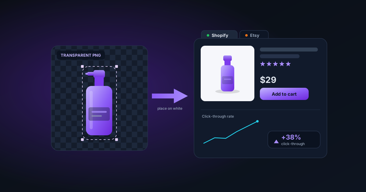
When you cut every product out to a transparent PNG, you regain control. You can drop all of them onto one shared background colour, and suddenly the shop grid looks like a brand instead of a camera roll.
Step 1: Shoot loosely, decide the background later
The mistake is shooting against the final background. Don't. Shoot your product against whatever plain-ish surface you have, leave generous margin on all sides, and remove the background afterward. A transparent PNG is a reusable master — you can place it on white for one platform, a soft grey for another, and a lifestyle scene for your ads, all from the same file.
Open the background remover and drop the photo in. The AI isolates the product and returns a true transparent PNG (the kind that stays transparent in Photoshop and Canva, not the kind that turns black — more on that distinction in our premultiplied alpha guide).
Step 2: Choose the right background per platform
Here is where Shopify and Etsy diverge.
Shopify rewards consistency above all. Pick one background treatment for your whole catalogue and never deviate. The two that perform reliably:
- Pure white (
#ffffff) if you want a clinical, Apple-store feel. - A very light warm grey (around
#f4f2ef) if your products are themselves white or pale — pure white makes a white mug disappear at its edges, and a faint grey gives it a silhouette.
Etsy rewards warmth and craft. A flat white background often reads as "drop-shipped" to the Etsy audience, who are there partly for the handmade story. A transparent cutout dropped onto a subtle paper texture or a soft gradient frequently outperforms stark white for handmade goods. The cutout still does the work — it removes the distracting original background — but the new backdrop signals care.
Use Add Background to drop your transparent PNG onto a solid colour or gradient, or the image editor if you want it sitting in a real scene.
Step 3: Crop for the thumbnail, not the full view
Both platforms display your image far smaller in search than on the product page. Etsy's search thumbnails are roughly square; Shopify's depend on your theme but are usually square or 4:5. The product should fill 80–90% of that frame. The most common conversion leak is a beautifully cut-out product floating tiny in the middle of a huge canvas — at thumbnail size it looks like nothing is there.
After cutting out, use Smart Crop or the canvas tools to tighten the frame so the subject dominates, then export at the platform's preferred square ratio.
Step 4: Size and format
| Platform | Recommended longest edge | Format | Notes |
|---|---|---|---|
| Shopify | 2048 px | JPG (white bg) or PNG | Shopify zooms to 2048px; smaller files look soft on retina screens |
| Etsy | 2000–3000 px | JPG or PNG | Etsy compresses; start high so the compressed result stays crisp |
If you cut out a product and want a transparent PNG for ads but a flat JPG for the listing, export both from the same master. Don't re-photograph.
A repeatable batch workflow
If you have more than a handful of products, don't do this one photo at a time. Shoot the whole catalogue, drop the folder (or a ZIP) into the background remover, and let it cut every image. You get a ZIP of transparent PNGs back, then composite them onto your chosen background in a second pass. We walk through the throughput and memory considerations of doing this at scale in a dedicated batch article.
Common conversion leaks to avoid
- Inconsistent lighting across the grid. Cutting out the background helps, but if half your products are warm and half are cool, the grid still looks off. Run a quick white-balance pass before exporting.
- Hard edges on fuzzy products. Knitwear, plants, and pet products have soft edges. If the cutout looks like it was sliced with scissors, the eye notices. Use the Best Quality model for these — see our hair and fur guide.
- Forgetting the mobile crop. Most Etsy and Shopify traffic is mobile. Always preview your thumbnail at phone size before you commit.
Privacy note for sellers
Your unreleased product photos are sensitive — they often reveal inventory and designs before launch. Everything above runs entirely in your browser. No image is uploaded to a server, so there's no risk of a leak from a third-party cutout service. That matters more than it sounds when you're prepping a seasonal drop.
The one-line takeaway
Treat the transparent PNG as your master file, then compose per-platform: consistent and clinical for Shopify, warm and crafted for Etsy. The cutout is the same; the background is the strategy.
Was this article helpful?
Your answer is saved in this browser only. This control makes no network request and does not send the answer to an NSS feedback endpoint.